
1. Black


Black paint is one of the hottest trends for walls this year. “Black has been trending over the past few seasons. It is bold, dramatic, but also neutral, so easy to live with,” says Caroline Harmon, an art director and design forecaster at Lowe’s. Darkroom, from HGTV Home® by Sherwin-Williams (and on the walls in the photo) is a dimensional black with purple undertones that works as a versatile, contemporary neutral. “You can get the drama of a color like purple, but you can live with it for longer,” Harmon says.
Darkroom is one of 10 colors HGTV Home® by Sherwin-Williams' Vintage Homestead collection, hues that are a little bit 1980, a little bit 1880 and completely contemporary. It’s an impressive palette with sophisticated shades of black, gold, purple and green that can be mixed and matched together. “They have a modern farmhouse feel,” Caroline says. “These colors create a cozy feel, while not being too overwhelming.”


2. Gray

We still love gray paint, but we’re going for richer versions of this former It color. “The shades we’re seeing now are slightly warmer, bringing that extra layer of warmth and comfort that people are craving in their homes when it looks like we’re heading into uncertain economic times, Caroline says.
We’re not painting entire rooms in shades of gray and accessorizing with cool black and white like we were in the 2010s, Caroline says. We’re mixing gray with warmer hues to add depth and create a curated, soothing space.


3. Sage Green

Nature-inspired greens are having a moment. That’s because biophilic design, an architectural movement that’s all about making buildings feel more like the natural world, is showing up in interior design. Designers are using colors meant to connect us to nature, so we feel less alone. “People gravitate to warmer, earthier colors for comfort, simplicity and the sense of calm that being in nature brings,” Caroline says.
Enter sage green paint, in a range of hues. Pewter Green, from HGTV Home® by Sherwin-Williams, is a quintessential sage green that looks like it was plucked from a forest. Flora (on the wall in the photo) is “a deep, blackened olive that embodies charm and sophistication,” said Valspar color marketing manager Sue Kim in a press release.
We’re not going for bright Kelly greens, though. We want muted greens. “Muted tones are more soothing, and pair really well with wood tones and other neutrals and natural materials that are also trending heavily,” Harmon says.


4. Blue

We want nature in our houses, and few colors connect us to sky, air and water like blue. “Blues are always in, from classic navy to coastal and spa-like hues,” Caroline says. “Blue can be energizing, and it’s a good choice in an age when our homes have become a haven, a place to relax and recharge in an age of uncertainty.”
This year’s trending blue paints range from pastel to jewel tones like Everglade Deck. “Use it as an elegant, calming hue to restore the mind, body and home,” says Sue in a press release. Blue Arrow has warm undertones that will look great paired with copper accents.


5. Mauve

Throwback colors are big right now. Glamour, from HGTV Home® by Sherwin-Williams and seen on the walls in the photo, is a little Victorian, a little ‘80s. “It is nostalgic, playful, but can also play as a neutral,” Caroline says.
There are a lot of paint colors that evoke the past trending this year, Caroline says. “The nostalgia felt in this palette is about people finding comfort in things that feel familiar. Our homes have become a haven in uncertain times.” And to make our homes a haven we are choosing colors that remind us of a time when things seemed more in focus.
Updated mauve paint colors are sophisticated iterations of Millennial Pink and Barbiecore, a mashup of plum, blush and pale gray. “Colors like Glamour bring in a feminine touch without being an obvious pink,” Caroline says. “I’ve seen this color being used a lot in bathrooms and kitchens, which means it’s here to stay for a while."


6. Purple

Purple paint is in, but not Prince’s purple. We’re loving deep, earthy plums like HGTV Home® by Sherwin-Williams' Poetry Plum, seen on the wall in this photo. It’s also a year of icy purple paint like Gentle Violet, which is essentially a white shade warmed with violet inspired by the glow of our devices’ screens. “This shade embodies harmony inspired by digital connectivity,” says Sue in a press release.
You’re going, wait, what happened to biophilic design? How did we go from wild nature to the electronic glow of our screens? Gentle Violet makes a great backdrop for furniture, accessories, and window treatments in nature-inspired colors like sage green, apricots or warm browns. And that’s the point, mixing the digital world with the natural one. We go to the Valspar press release for the details: “The line between natural and artificial colors has been blurred, creating a new look that’s reflective of the world we live in.


7. Brown

Brown paint, not seen in interiors for a generation, is back. “Color palettes have warmed up since our 2010s obsession with everything gray, so browns are being layered with grays to create depth,” Caroline says. “The look is sophisticated, but still very much tied back to nature.”
This year’s browns are warm and alive. Hot Cocoa, from HGTV Home® by Sherwin-Williams and seen in the photo on kitchen cabinets, has pink undertones. It’s more of a modern mauve and a good pick for someone who wants to dip a toe in the brown trend. Other popular brown paint colors have warm, rosy glows, too, that make a room feel comforting.


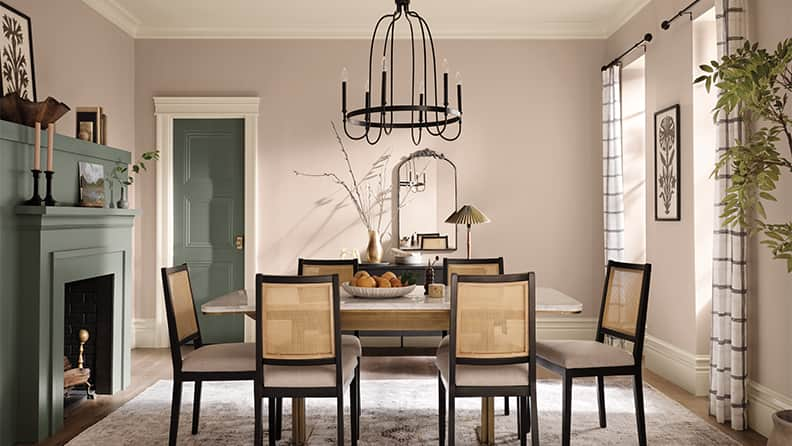
8. Beige

Beige never goes out of style, but the trending version of this hue is warmer than the grieges of the early 2000s. This year’s beige paint has soothing undertones of yellow or even rose, not chilly gray. These colors are super easy to incorporate into an existing room because beige goes with almost any furniture and accessories.
Natural Linen, from HGTV Home® by Sherwin-Williams and shown in the photo, warms and brightens a room. “These colors are an easy update for main living space, bedroom, hallway or kitchen,” Caroline says. “They can be used next to rooms painted other color, so they are a great way to break up the monochrome feel in a house but still keep it neutral and connected.”


9. Gold

Holmes Cream (on the wall in the photo) sums up the vibe for this year's version of gold paint. This flashy hue has been turned down a few notches tonally, so it calms a room. We don’t want blingy and bright, we want soothing serenity. “Restrained Gold (from HGTV Home® by Sherwin-Williams) pairs beautifully with deeper shades like Darkroom for chic contrast, as well as light neutrals for a softer look,” Caroline says. “I would love to see it on cabinets in a farmhouse kitchen or in a bedroom on beadboard millwork paired with a vintage-feel wallpaper.”


